Customise your design
Find out how you can customise the layout and components of your Browser website.
Brand
We’ll apply your branding to the Browser website, including your logo, colour scheme, and fonts. We’ll copy these aspects from your main website.
Homepage components
The Browser homepage has these components:
- Template layout
- Banner
- Featured collections
- Highlights
- Topics
- Search
- Explore tags
- Explore by colour
- Bird’s Eye View
Template layout
You can choose a 3-column or 4-column layout.
Banner
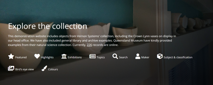
The banner spans the width of the page and includes:
- An image (2500 pixels wide).
- An introductory paragraph. This can include the total number of items in the collection with a link to view more. The number of items is automatically calculated and kept up to date.
- Links to content on the site such as featured collections and highlights.

Featured collections
The featured collections component can display any number of tiles that link to each of your collections. Usually 3 to 12 featured collections are shown on the homepage.
Each collection tile requires an image. The image must be:
-
In landscape orientation.
-
Between 1200 and 1500 pixels wide.
-
In .jpg file format (the file extension must be in lower case, that is .jpg not .JPG).

Highlights
The highlights component can display any number of tiles that link to your highlight sets. Usually 3 to 12 highlight tiles are shown on the homepage.
Each highlight tile requires an image. The image must be:
-
In landscape orientation.
-
Between 1200 and 1500 pixels wide.
-
In .jpg file format (the file extension must be in lower case, that is .jpg not .JPG).
See Highlights.

Topics
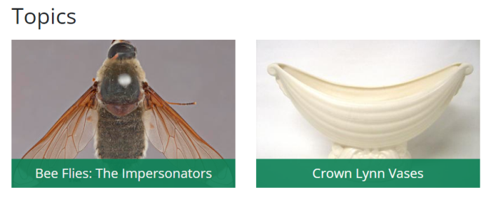
The topics component displays your Topic records.

Search
The Search component contains:
- A short introduction.
- Tips on searching.
- A search field.
- A link to advanced search.
You can customise the introduction.

Explore tags
You can let people explore your collection by maker, subject, and classification tags. Each tag include the number of items with that tag. You can choose not to show the number.

Bird’s Eye View
The Bird's Eye View presents a full screen mosaic of your collection images. We work with you to decide whether this will include all collection images or a subset. We also help to decide on a sensible sort order for the collection images. For example, depending on your collection, sorting by maker, production date, or object type may provide interesting groupings of images.
The Bird's Eye View can be used as a starting page on touch screens if you decide to use your Browser website to provide in-person visitors with access to your Browser collection website.
The Bird’s Eye View component on the homepage is a static image that links to your Bird’s Eye View page.

Explore by colour
You can let people explore your collection by colour.
See Colours.

Video, audio, and 3D content
We can display content from any third-party app that has an embedded player available.
You can add:
- Video players such as YouTube and Vimeo.
- Audio players such as SoundCloud.
- 3D components such as SketchFab.
Prepare your video, audio, and 3D content
Review and changes
When we’ve finished setting up the design, you review the site and tell us about any changes you would like. The first round of changes is included in the cost. Repeated reviews can incur an additional charge.
